NIST Uncertainty Machine
A couple of months ago, I was scrolling through hacker news headlines. I saw NIST's Uncertainty Machine, checked out the website and thought it was cool. But it looked awful, suffering from severe "developer design". My heart sinks a bit when I see these sites and I think "if it looked better, people would totally use this more!" In fact, this idea is backed by a princple called the Aesthetic Usability Effect based on research by the Nielson Normann Group.
In short, The Uncertainty Machine is a web-based tool to measure uncertainty for many different applications, some being for the age of a meteorite and for electrical resistance measurements. I'm definitely no scientist and really have no idea how to use this tool. I really wanted to make it look better and enhance the overall user experience. This wan't a simple charity design case, I wanted to learn some skills like mobile first design, UX/UI concepts and applications, use grid and flexbox, and learn more about forms.
Overview
I first copied the website down to my computer, fixed file paths and got it running locally to review the code. There is some use of flexbox, lots of unncessary div's and some serious jquery code! I sketched out a sitemap, the error pages are generated server side.
I mapped out some basic user flows, consisting of a filling out the form manually or submitting a configuration file. Since this tool is very specific to a science domain, scientists, researchers or students would be the main users. The config file upload was probably built to reduce filling out the form for each new run, which can be downloaded from the results page. Input variations would be changed over and over during research, this flow enables a faster re-calculation process.
I googled "uncertainty machine" and NIST's app was the only substantial find in the results. "Measuring uncertainty" produced articles and papers on the formula's used but no tools like the NIST app. I figured that only a small range of domain specialists know about this tool. I wonder how they would find it or even know about it, time to send an email to the authors! Unfortunately the response didn't provide any info about users.
UI Audit
The authors have a detailed manual explaining how to use the tool. I compared the code with the manual and how the app actually works and made some notes.
- The Random Number Generator is supposed to be between 1 and 100 as per the manual, but you are able to exceed that amount. Not sure if that is ok or not? The computation still runs fine with numbers > 100.
- Number of Realizations should not exceed 5,000,000 per the manual but the field displays no error when over the max amount, it needs a validation check
- Some of the input parameters cannot be 0 but there is no validation check for this
- Some errors are displayed after running the computation and returning an error, they could be displayed client side and save a redo-step
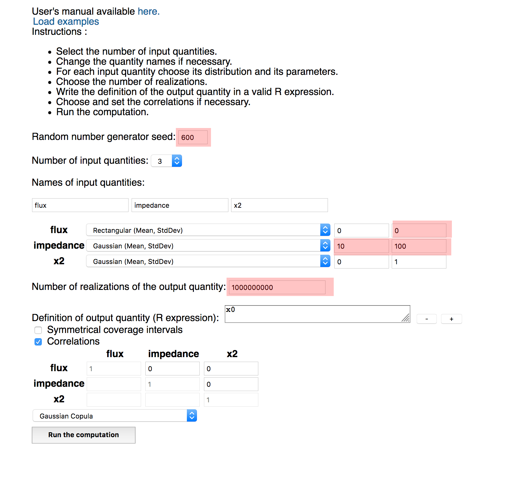
NIST UI Issues
- The text and form layout looks like someone just threw it together, a grid layout would provide some order
- The input and button styles use the browser defaults, it makes them feel boring and weak.
- The font and input sizes should be bigger, in fact everything could be bigger
- The Definition of Output Quantity buttons move when new boxes are added, this is confusing. They need a home to make clicking easier on the user.
- New input name fields are placed next to the previous field creating a look of disorder. A grid would provide a stronger sense of layout.
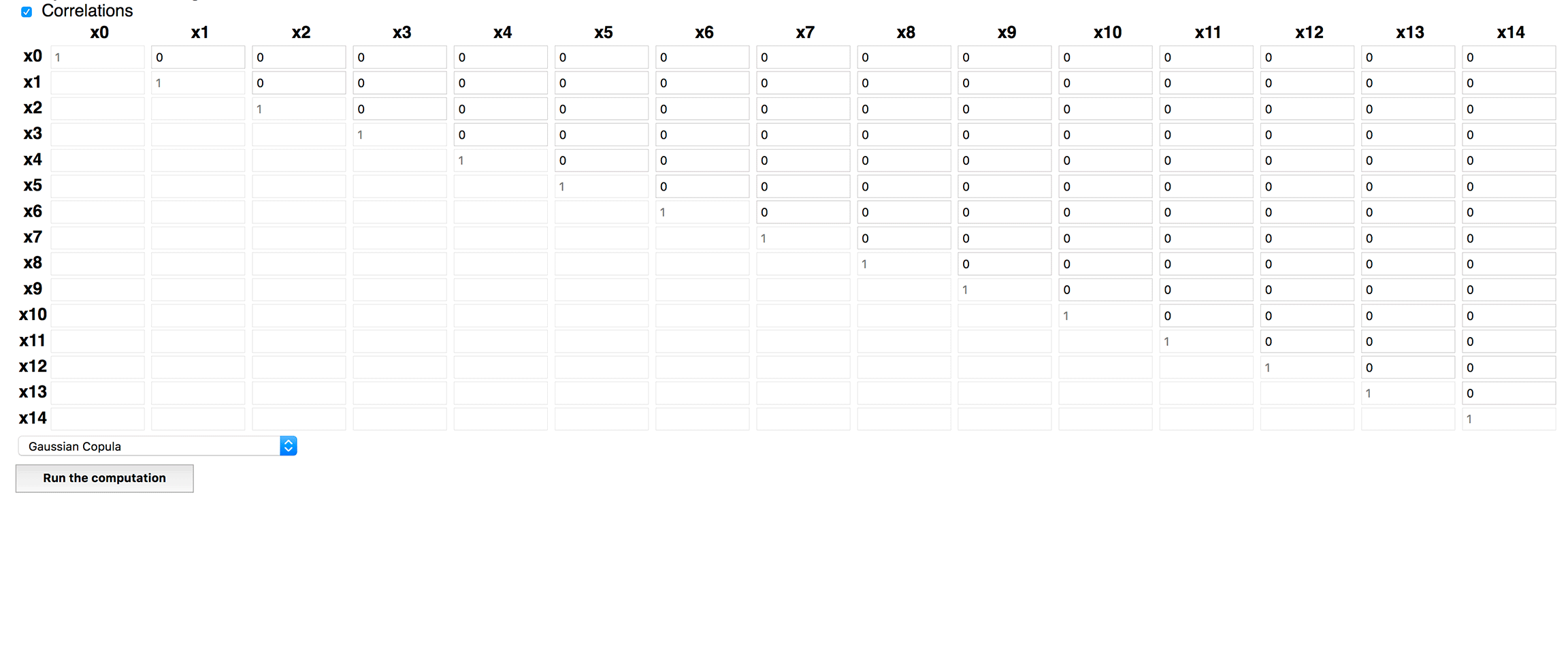
- The names of the input quantity fields map to the distribution select-option rows and the correlations table. But they are so far apart that it makes it semi-painful and challenging for my eyes and mind to criss cross back and forth. They need to be closer, but how?
Input Measurements
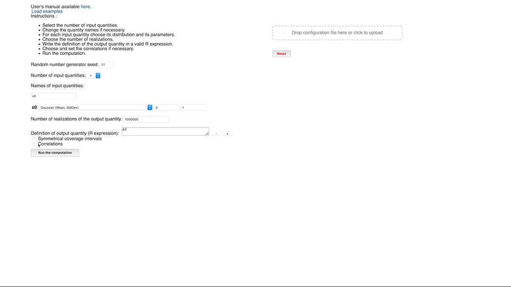
I compared the Zero State, the default page on initial visit versus the Maxed Out 100 State, all possible elements displayed.
| Input Type | Zero State | 100% State |
|---|---|---|
| Total | 15 | 337 |
| Text | 6 | 303 |
| Select List | 2 | 17 |
| Checkbox | 2 | 2 |
| Text Areas | 1 | 10 |
| Drag n' Drop Zone | 1 | 15 |
| Buttons | 2 | 4 |
UX Audit
This tool has the flow of being designed for one user: the original authors. It looks like they built the tool for their own use and then shared it with others. It lacks any clear directions, explanation of how the fields are related or descriptions of what the fields mean. Some context would help!
To be fair, the bullet point list does provide instructions at the top. But it only increases the mental cost of mapping each point to it's respective input. How about moving these directions closer to the point of action, reducing the overall user's effort?
Project Scope
With no guarantee that the authors would use my design, I narrowed my scope to just the first page. This is the primary focus of the tool anyways and needed the most work. My main focus centered on the input types and making the page responsive for mobile.
This is a data driven form with potentially many inputs, so they needed to look much much better. Another major goal was visually group the inputs into 3 main steps. There would also need to be some jquery code edits to enable some UI changes.
Plan of Action
Uncertainty Machine it is! Uncertainty in how to use and what the fields mean. Machine confers order and systematic processes, something the tool does do. Figuring out how to cut the steps down, design a better form inputting experience and creating an orderly machine like grid to the site became my challenge.
I spent a few days It took a couple of days of cluelessness, but I felt like I had made the insights I needed to proceed to the actual coding. Experimenting with different combinations and grouping of inputs revealed a natural order of operations that could fit into 3 main actions with associated sub-steps.
This is a data driven form with potentially many inputs, so they needed to look much much better. Another major goal was visually group the inputs into 3 main steps. There would also need to be some jquery code edits to enable some UI changes.
Site Layout
I wanted to keep the main layout design in tact but updated it for Grid and for mobile responsiveness I set up a sticky footer with grid areas dividing up the header, content and footer. Cleaning up the HTML was more work that I thought it be, but it is crucially important.
HTML sets the document structure which is helpful for organzing the page but also for accessibility as well. HTML 5 elements like section, article, nav, and aside are now processed by the HTML Outline Algorithm that creates a page hierarchy that is considered an important best practice. div's don't have a semantic structural meaning. They are useful for non-semantic styling like wrapping some code with a class for styling purposes only.
There were tons of div's in the index.html that needed an HTML5 update. Check out this handy outliner tool and this in-depth article Use the HTML Outliner plug-in for Firefox as well.
For the header, I searched around for NIST SVG logo and found a higher resolution graphic. I used flexbox to set the logo, title, and version and responsified it for mobile.
The Form
Forms on mobile devices without any styling don't look that great. After some googling, I found the very insightful WTFFORMS by Mark Otto, creator of Twitter Bootstrap.
The main concept is wrapping inputs with additional markup that hides native stylings and replaces it with a prettier looking input with heavy css modifications. Reading through the source code was exceptionally insightful to see how an expert approaches form enhancements!
The original site used text types for number fields with no client side validations. I updated the input types of text and changed them to number. The browser puts number arrows on number inputs and can be overridden them with some css and javascript.
I moved the correlations table to the input quantities section. I removed the names for the quantity input fields and inlined them with the select-option dropdowns.
Quantity Inputs
Forms now have an API that allows you to detect for different input states. Using these new psuedo-classes for form inputs, I set up validation logic that displayed client side validation checks instead of waiting for an error page returned after a submission.
Input Validations
UXMovement.com has many great articles emphasising specific UX techniques backed by data and user science. Reading through this site provided guidance on where to place input errors, offsetting input fields for user's eyes and much more.
Before I started to code a section, I would read through UXMovement to understand how I should approach the problem. It became a serious u-turn in my approach to just code and refactor after realizing your first idea had no thought behind it.
The Table
With a data intensive calculation, the inputs and distributions table breaks the layout. I rewrote the markup to use grid, applying the awesome grid cheat code,repeat(auto-fill, minmax(1fr, 1fr)) on each row. I made the table responsive to display columns on mobile. I highly doubt anyone would use this on their mobile phone for serious work, but I like things to look nice and grid makes this so much easier.
CSS Grid Table
In Sum
There are so many other design decisions that could be described, but I chose to provide a high level overview.