Flexulator
A couple of years ago I was learning Flexbox and Grid for web page layouts. Both standards have changed front end development for the better and modernized the tools front end devs so badly needed.
While learning flexbox, I got inspired to build Flexulator a handy tool that visually illustrates how the spacing algorithm works. The first version was made in 2018 and I decided to update the website with an improved look and refactor the spaghetti code.
In this post I'll cover some javascript refactoring, build tooling process, some UI/UX improvements and how to stay motivated while working on a side-project.
Inspiration
Flexbox's spacing algorithm isn't intuitive when you are first learning, but several CSS experts have written great articles explaining the math behind how it works.
Firefox Dev Tools inspired the look and feel, I cold copied styles and colors to give the site the look and feel of a web tool. Check out how they designed the Flexbox inspector.
Improvements
The first version was a 500 line spaghetti code mess of code that worked, but it needed improvements. The UI was good, I got a lot of compliments.
- Calling 10+ functions that loop over the same elements and update their text fields. Could be improved with first reading, calculating and then writing to the DOM.
- Lack of code design, which is fine but would help in keeping the calculation functions easier to write. An Observer design pattern could be a good idea for the next version.
- An explanation of each formula value.
- A easy way to get the calculator into a grow and shrink "mode". User has to manually change values to trigger shrink condition.
- Any performance boost's for a faster page load.
Workflow
Side projects require evenings and weekends and a workflow that optimizes for small wins and incremental progress. Time contraints force you to be more intentional and specific with your work.
I use Github Issues, Milestones and Kanban Board to break down features into smaller tasks which are easily tracked. I use these tools like a Trello board, referencing articles and stackoverflow posts for each issue/card as well keeping checklists of all the steps required to complete the task.
If you keep track of each work session and document it, you'll see how much work goes into a "simple" component of a feature. This is crucial for learning and planning your next side-project, if that's your thing.
Having worked on agile teams as a test analyst, we were required to track our progress on our current iteration cards. It built a habit of keeping a history, very helpful for many reasons like proving that you actually do work at your job.
Unlike working on an agile team, side projects are full of unknowns as you start to build it. You realize things will require more time as you need to learn about a technology, research the numerous possible approaches and try out several failed attempts.
Github Issues
Quantifying Work
Milestones are great for breaking down your project into smaller chunks and then further decomposed into cards. Quantifying your work helps to wrap your head around the problem. Maybe you want to learn a new technology paired with skills you have picked up. Planning this out will help you stay on course when you get lost in the weeds and frustrated. Maintaining that big picture can maintain motivation and provide clarity.
Most of my efforts will be refactoring the javascript and making some design changes. Here is a table of all the UI elements that will require new code.
| UI | Total | Desc |
|---|---|---|
| Events | 3 | resize, add, remove |
| Shrink Fields | 14 | text fields |
| Grow Fields | 10 | text fields |
| Buttons | 4 | update flex item values |
| Tabs | 3 |
That's a grand total of 34 UI elements to code and design. That's a lot more work than it seems when you first start out and understanding this helps you not lose motivation when you are going slower than you anticipated.
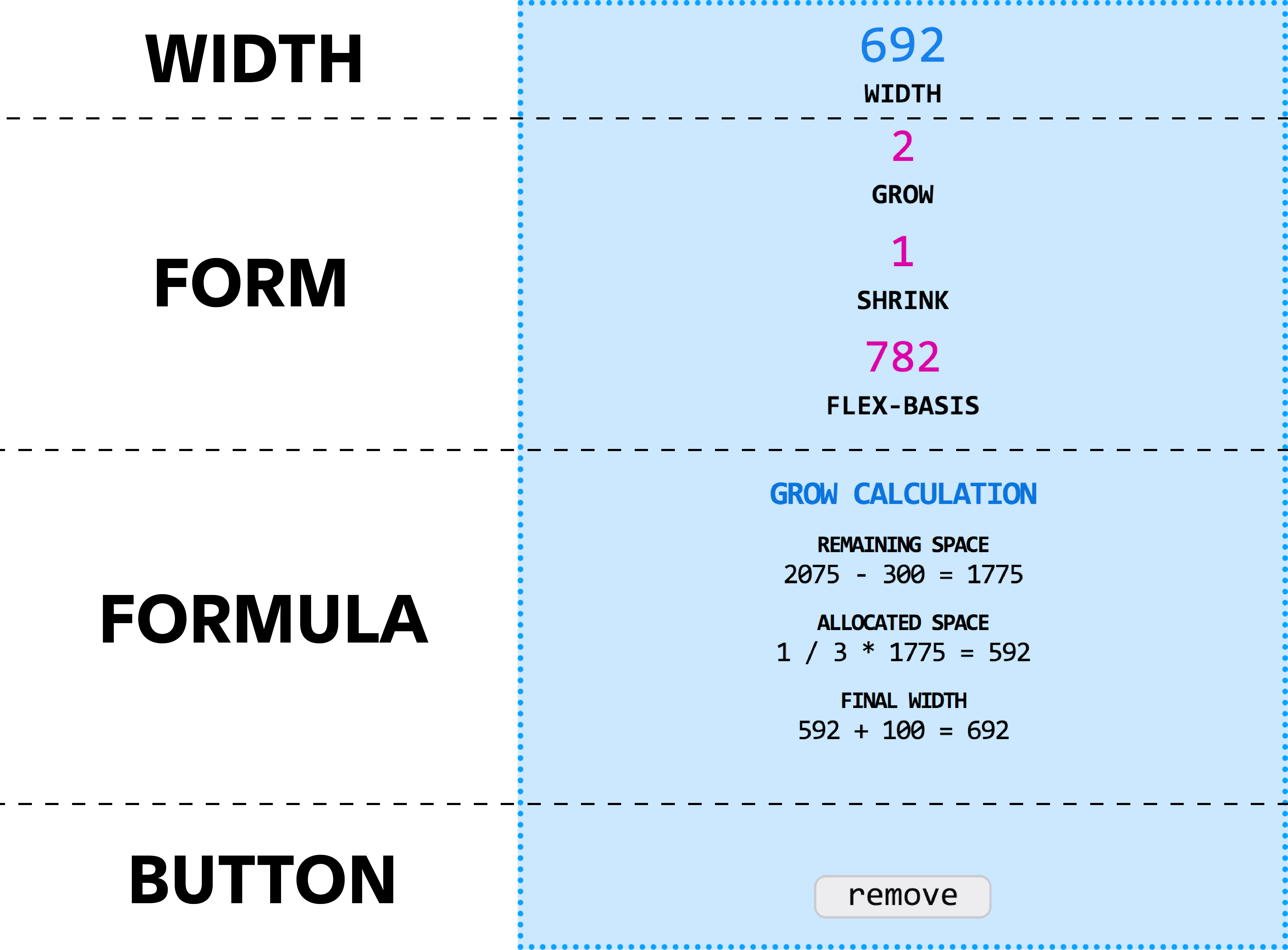
Grow vs. Shrink
Buttons at the bottom of the form allow the user to toggle between grow and shrink scenarios. This really helps to see the how the two formula's work right in the browser.
The grow button will make each flex-item size only 100px so that the total-flex-basis is significantly smaller than the container. The shrink button does the opposite, increasing each flex item size to make the total-flex-basis exceed the container size.
Grow & Shrink Modes
Grow and Shrink Explained
I break the math down into a multi-step process that hopefully makes it understandable as to how the spacing algorithm works. A nice animation helps too. Heavily referencing Mike Riethmuller here.
Flex Formula
Critical CSS Inlining
I've heard about inlining above the fold styles or critical CSS and had to try it out. There are several npm packages out there and I went with critical by Addy Osmani. It's super easy to setup and get going, it also offers multiple viewport sizes. Add this to your build process and it will improve performance which you can check with Chrome's Lighthouse
In the code below, I'm running critical against the /dist directory which will read the index.html and output a new index.html in the same directory, overwriting the original.
        var critical = require('critical');

        critical.generate({
          inline: true,
          base: 'dist',
          src: 'index.html',
          target: {
            html: 'index.html'
          },
          minify: true,
          dimensions: [
            {
              width: 320,
              height: 480
            },
            {
              width: 2000,
              height: 1000
            }
          ]
        });
With our above the fold critical css inlined into our page, you will want to load your CSS asynchronously to prevent unnecessary page rendering delay. CSS is typically loaded at the top of the page and will block page rendering.
Javascript Refactor
The first version was a 500 line spaghetti code mess of code that worked, but it needed improvements. When reviewing the code, it dawned on me that the shrink calculation in the third step was wrong. There are enough steps in the calculation to get things crossed up and some javascript objects could help keep my code better organized.
After writing some psuedo-code on paper, I determined a simple logic flow of 1) reading values, 2) doing calculations and then 3) writing them to the DOM upon a resize or flex-item addition or removal. This provided a simple model of thinking about how to structure my code.
Component Structure
The flex item is really the main component of the tool. Each flex item has it's own flex state reflected in the four sections below.
Flex Item Component
Each flex item object would have to keep track of each of these attributes on the UI. I set about creating a selectors object that references each child element within the parent element, an elements object that stored those elements for reading and writing, and finally a flexulations object to be used for reading/writing the flex values that are re-calculated on a browser resize or flex-item form change.
The UI will be modified with a function that reads the new flexulations and updates the DOM elements. You'll notice there is a container property that will keep track of the flex-parent item values. It will be needed in the formula for determining how much space is available.
When a user makes changes on the form, that items' flex values are updated inline on the object which is stored in the styles property. The rest of the flex-item functions use these properties for reading, calculating and updating each item. Each value on the UI get's it own function.
        style: {
          grow: 0,
          shrink: 0,
          flexBasis: 0
        },
        form: {
          width: 0,
          grow: 0,
          shrink: 0,
          flexBasis: 0
        },
        flexulations: {
          container: {},
          itemWidth: 0,
          grow: {},
          shrink: {}
        },
        elements: {
          self: null,
          form: {},
          flexulations: {
            container: {},
            grow: {},
            shrink: {}
          }
        },
        selectors: {
          form: {},
          flexulations: {
            container: {},
            grow: {},
            shrink: {}
          }
        }
Calculating
Most of the shrink functions are reading from the flexulations object and calculating other values used in the formula section. The shrink factor needs to be rounded to the 6th decimal to accurately reflect the browser calculation.
        updateItemShrinkBasis: function() {
          this.flexulations.shrink.valueBasisTotal = this.flexulations.shrink.value * this.flexulations.shrink.itemBasis;
        },
        returnItemShrinkBasis: function() {
          return this.flexulations.shrink.valueBasisTotal;
        },
        updateShrinkBasisTotal: function(shrinkBasisTotal) {
          this.flexulations.shrink.basisTotal = shrinkBasisTotal;
          this.updateShrinkFactor();
          this.updateShrinkComputedWidth();
          this.writeItemFlexulations();
        },
        updateShrinkFactor: function() {
          let shrinkQuotient = parseFloat(this.flexulations.shrink.itemBasis) * parseFloat(this.flexulations.shrink.value);
          this.flexulations.shrink.factor = parseFloat(shrinkQuotient) / parseFloat(this.flexulations.shrink.basisTotal);
        },
        updateShrinkComputedWidth: function() {
          let shrinkComputedWidth = this.flexulations.shrink.factor.toFixed(6) * this.flexulations.container.remainingSpace;
          this.flexulations.shrink.computedWidth = shrinkComputedWidth.toFixed(0);
        },
Flex Parent
The flex-parent keeps track of the flex-items that are added and removed as well as setting up all the events. This pattern resembles the Observer pattern but does not follow it strictly in a code sense.
        elements: {
          container: null,
          flexItems: null
        },
        flexValues: {
          width: 0,
          flexBasisTotal: 0,
          remainingSpace: 0
        },
        flexItems: [],
        functionality...
Flex Basis
Getting the total flex basis uses the reduce method to return the total basis from each item in the DOM and then writes this to array of flex-items that are built from the object we saw above. We also save it the flex-parent object as it is required to get the remaining space.
        updateFlexTotalBasis: function () {
          let flexBasisTotal = flexulator.elements.flexItems.reduce((basisSum, flexItem) => {
            return basisSum + parseInt(flexItem.style.flexBasis);
          }, 0);

          flexulator.flexValues.flexBasisTotal = flexBasisTotal;

          flexulator.flexItems.forEach(item => {
            item.flexulations.container.flexBasisTotal = flexBasisTotal;
          });
        },
Browser Resize
I could have put this in debounce function but I'm only updating text fields and there is no serious performance hit with constant updates. Plus, it is nice to see the values update in real time. We call five functions that update the container, item and the example values in the tabs section.
        updateResize: function() {
          window.addEventListener('resize', function() {
            flexulator.updateWidth();
            flexulator.updateRemainingSpace();
            flexulator.updateFlexItemsContainerValues();
            flexulator.updateFlexItemGrowFormulaExample();
            flexulator.updateFlexItemShrinkFormulaExample();
          })
        },